FREE SHIPPING FOR ORDERS OVER $199
60 DAYS RETURN POLICY
5% OFF FOR NEWSLETTER-SIGN UP
Meet the NCS Colour experts - Learn about colour trends & adding colour to your everyday life
More of us are choosing to show more colour in our lives, here at Broste Copenhagen.
MEET THE EXPERTS BEHIND YOUR FAVOURITE NCS COLOUR CHOICE
- If we don't have colour, we feel bad, says NCS Colours Creative Director Karl Johan Bertilsson when he and Marie Larsen, Marketing Manager at NCS Colour, visit us.
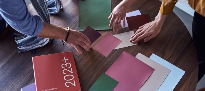
We've all been there, confused in the paint store and with a whole pile of colour cards in hand for an upcoming renovation project. On them are the letters NCS followed by numbers and letters that describe a unique colour.
- NCS is the only colour system that describes how colour looks, how we experience what we see. The "NCS code" as many call it, the NCS designation, is the description of a colour; blackness, saturation, whiteness, the shade and colour tone, explains Marie.
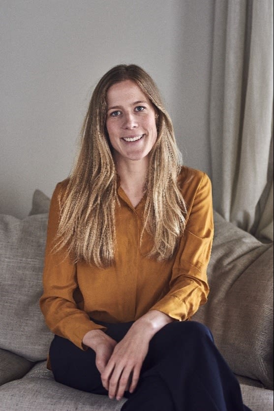
Marie Larsen, Marketing Manager for NCS Colour.

Karl Johan Bertilsson, Creative Director for NCS Colour.
DARE TO ADD MORE COLOUR IN YOUR WELL LOVED HOME
The idea that colours affect how we feel and how we act is nothing new. We all perceive colour differently and while some colours make us want to relax, others energize us.
- We need warm colours, such as warm red-brown shades for security, says Karl Johan and continues:
- But we also need to feel that something is happening in the room.
We need a pop-up colour, an accent that draws the eye and arouses our emotions.
It makes us act, so we charge our batteries with the safe colours, but we need a spark in everyday life that triggers us to take the next step, says Karl Johan.
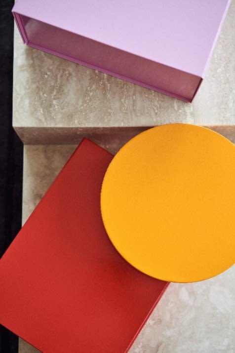
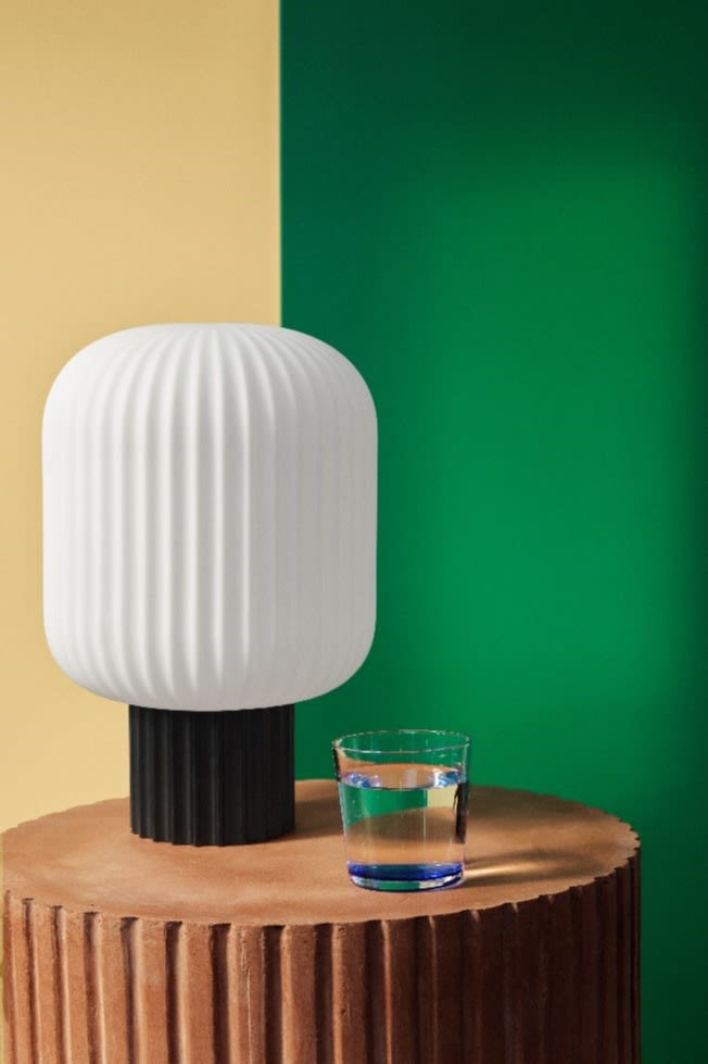
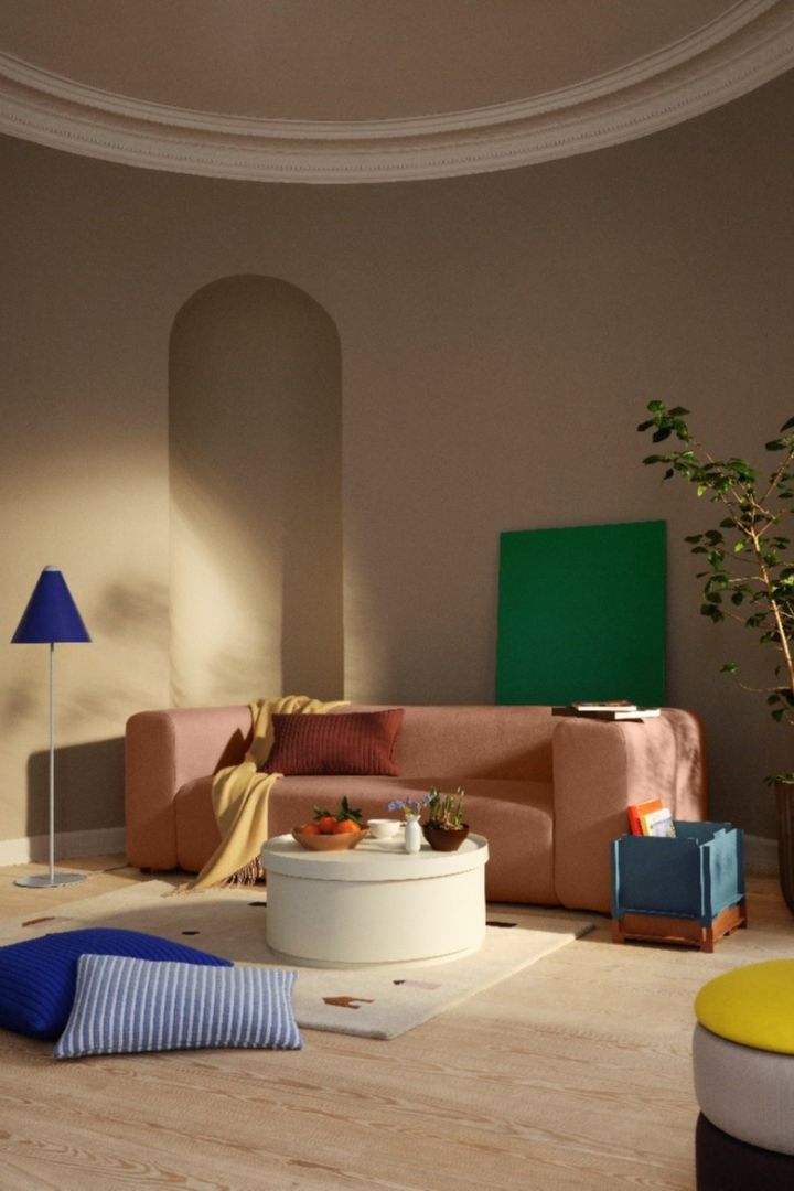
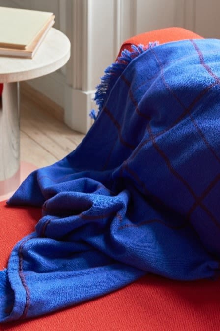
Tip: add a colourful accent to wait up the room! Moving forward we will see a lot of red, pink and orange.
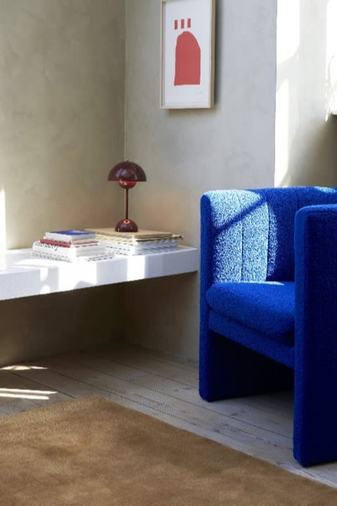
Red-brown tones create warmth and a sense of security, while the on trend cobalt blue provides energy.
We all have a need to feel that things are changing from time to time, that something is happening. We have long decorated our Scandinavian homes in tone-on-tone and calm, harmonious colours, but the need for something more is growing.
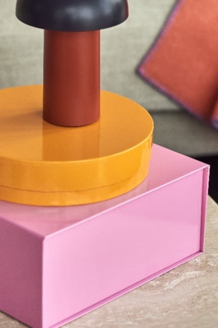
- Colour is really easy, you don't have to repaint your home, but you can use cushions, rugs or lamps to create new arrangements that give your home a fresh feel, continues Karl Johan.
- Contrasts are very important. Sometimes we would like to match a pillow and a lamp in the same colour, but it is very difficult to match them exactly. In which case it is better to invest in contrasting colours which still match nicely together, because we need contrast.
THE IMPACT OF THE PANDEMIC ON THE COLOUR CHOICES WE MAKE
The pandemic left its mark in many different ways and within interior design trends it is very clear how we are moving towards a new everyday life with new interior design needs. In Scandinavia we have long leaned towards varied neutrals in our colour choices, but the pandemic has changed our view of colour:
- Above all, we have become more aware of which colours we want to surround ourselves with because we have been in one place continuously, which means that we have now started to change our interiors a lot. We want more colour and it should feel unique and personal in the home, says Karl Johan and continues:
- According to research, colour trends move in a cyclical motion. If we are exposed to a certain colour for a while, we get tired and we then want to move towards the opposite range. It is a slow process and moves in stages going through other colour ranges in the process. We need to get used to it little by little until we reach the other extreme. This is why we keep hearing that the 70s are back.
Today, many make reference to the colours of the Millenium being back, for example.
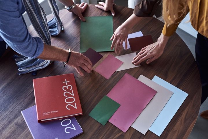
EXPERT TIPS ON HOW TO CHOOSE THE RIGHT COLOUR
There is quite a lot to think about when it comes to choosing a colour. What exactly should you keep in mind when choosing the perfect colour for a room?
The most important thing is to understand how the colour we choose is experienced together with the other colours we have in our interior. A colour almost never lives alone, and it is the context that is important and not the individual colour.
- If we try to choose a colour that should be the same as another colour we already have in another material, the result can feel very wrong depending on small shade differences and how the experience changes on the different materials or in different light sources. It is often better to choose colours that have contrasts to avoid these problems, advises Marie.
THIS IS HOW YOU READ AN NCS DESIGNATION IN 3 STEPS
Back to the paint store and when you are standing there with your samples, what does the designation on them actually mean and how do you read an NCS designation?
You read an NCS designation in three steps:
- Find the colour tone e.g. R20B
- Find the shade of that colour, ie. how much blackness and chroma (intensity) there is in the colour, e.g. 1040
- Combine these into a designation: NCS S 1040-R20B. Now you have a colour tone that is red with 20% blue. The colour tone therefore has 80% red in it (R20B). The shade of R20B is 10% blackness (S) and 40% colour (40).
- Since the overall shade is always 100%, this colour also has 50% whiteness in it (W). The less chroma, the more the colour moves into the grey scale. This gives you, what we would colloquially call, a beautiful powder pink colour.
- NCS has just increased the number of standardised NCS colours from 1950 to 2050, says Karl Johan!
- Now that we understand the NCS designation, it suddenly feels less confusing to choose colours!


Decorate with colour
